Colour Magnitude Diagrams
Download all the Jupyter notebooks from: https://github.com/HeloiseS/hoki_tutorials
Initial Imports
[7]:
import matplotlib.pyplot as plt
from hoki.cmd import CMD
from hoki.load import unpickle
import hoki.constants as hc
import pickle
import numpy as np

%matplotlib inline
plt.style.use('tuto.mplstyle')
Quick set-up things
Getting the Stellar models and input files
Colour Magnitude Diagrams (CMDs) are created by reading in the BPASS stellar models listed in the model_input files that can be found in the BPASS output folders (e.g. bpass_v2.2.1_imf135_300). These stellar models are in a separate directory (because it is absolutely massive), so you will have to download it separately if you want to run the following cells or make your own CMDs.
NOTE: You will be able to run the cells in the section “Loading a pickled CMD file” even if you can’t download the full set of stellar models
The stellar models and input files can be downloaded from the google drive (bpass-v2.2-newmodels for the models and e.g. bpass_v2.2.1_imf135_300 to get the required model_input files). Then you will have to change the path to the models in the settings.yaml file – this can be done using the set_models_path function contained in the hoki.load module:
[8]:
# The following path is valid on my machine - make sure you put the right ABSOLUTE path for your system
hc.set_models_path(path='/home/fste075/BPASS_hoki_dev/bpass-v2.2-newmodels/')
Looks like everything went well! You can check the path was correctly updated by looking at this file:
/home/fste075/hoki/hoki/data/settings.yaml
NOTE: You will have to reload hoki or restart the kernel at this point if you’ve jsut updated the yaml file :)
Which BPASS version?
In order to make the CMDs, the code needs to search through the BPASS models - they contain a large grid (historically called “dummy”) filled with stellar parameters, including magnitudes.
This grid can differ between BPASS versions - for example v2.2.2 sees the addition of Gaia filters and an expansion of the grid.
You can check which version of BPASS is considered by hoki in the hoki.constants:
[9]:
hc.DEFAULT_BPASS_VERSION
[9]:
'v221'
Change the BPASS version
If you need to use a different BPASS version, you can specify it when instanciating the CMD object:
Instead of just CMD(input_file) (see below) you can set the BPASS version like so CMD(inpute_file, bpass_version=[bpass_version]). In the following example we’ll use the default BPASS version and in that case you don’t need to specify anything.
NOTE: The BPASS version format is the following: v221 or v222.
Change the DEFAULT_BPASS_VERSION
If you’re going to be using a different BPASS version consistently, you might as well update the settings.yaml. You can do that by calling hoki.constants.set_default_bpass_version(version). Again, version is either v221 or v222 (make sure you parse strings).
Just like updating the path of the models file, you’ll need to reload the jupyter notebook after you’ve called this function and updated the .yaml file.
CMD objects
Making the CMDs
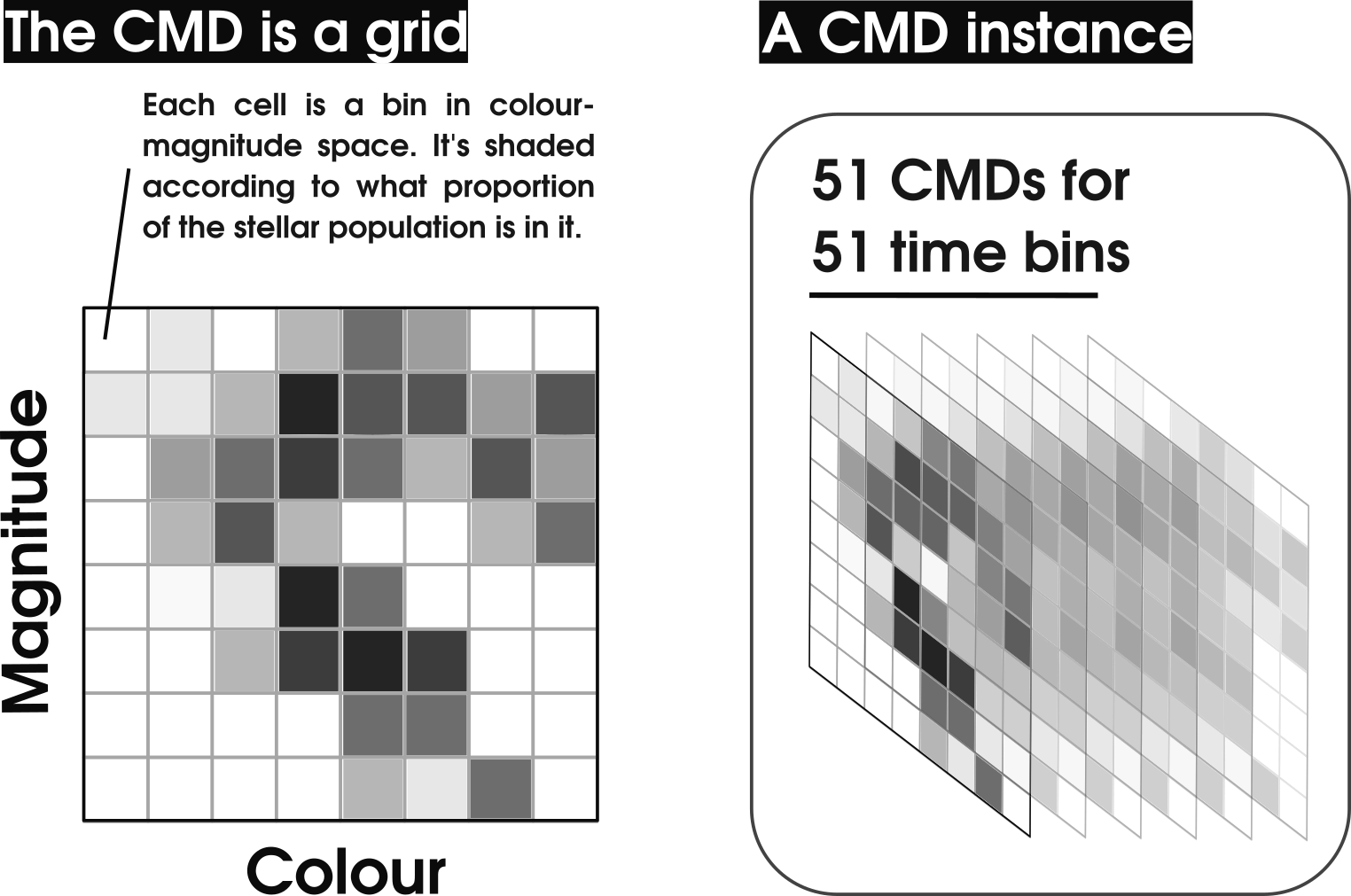
To create a synthetic CMD, hoki creates a grid in colour-magnitude space and then consults the entire set of stellar models to fill that grid. It is basically a histogram - the value of each cell/bin increases according to the proportion of the stellar population that falls into that bin. You could just plot this grid with a colour-map like an image, but we traditionally create contour plots for visualisation.
In hoki you will be creating a CMD() object instanciated with a model of your choosing (a particular IMF and metallicity)- for this you need to provide the location of a BPASS input file.
To know WHAT to do with this information, we also need to give the two broad-band filters we are interested in to make the plot filter2 Vs filter1-filter2 (e.g. V Vs B-V). This is given in the CMD.make() method, which actually creates and fills the CMD grids.
NOTE: This step is the most time consuming because there are thousands and thousands of models to look at. For that reason it also take much longer for the binary stellar models than the single star models to make a CMD. In the next section we will show you how to avoid having to go repeat his step in the future
The good news is that once you have instanciated and ‘made’ the CMD object, plotting it is VERY fast and you have a CMD for each time bin, which are also trivial and quick to access.
[10]:
# ONLY RUN IF YOU HAVE THE MODELS IN YOUR MACHINE

# Update this path if you want to run this cell
input_file = '/home/fste075/BPASS_hoki_dev/bpass_v2.2.1_imf135_300/input_bpass_z020_bin_imf135_300'
mycmd = CMD(input_file)

# actually makes and fills the grids - this is the time and memory consuming step
mycmd.make(mag_filter='V', col_filters=['B', 'V'])
/home/fste075/hoki/hoki/cmd.py:195: RuntimeWarning: divide by zero encountered in log10
  self._log_ages = np.concatenate((np.array([0]), np.log10(self._my_data[1,1:])))
/home/fste075/hoki/hoki/cmd.py:211: RuntimeWarning: divide by zero encountered in log10
  self._log_ages = np.concatenate((np.array([0]), np.log10(self._my_data[1,1:])))
Below is a summary illustration of what the synthetic CMDs are and what a CMD() instance is.
You can easily access the grid by simply calling the attribute CMD.grid
[11]:
mycmd.grid
[11]:
array([[[0., 0., 0., ..., 0., 0., 0.],
        [0., 0., 0., ..., 0., 0., 0.],
        [0., 0., 0., ..., 0., 0., 0.],
        ...,
        [0., 0., 0., ..., 0., 0., 0.],
        [0., 0., 0., ..., 0., 0., 0.],
        [0., 0., 0., ..., 0., 0., 0.]],

       [[0., 0., 0., ..., 0., 0., 0.],
        [0., 0., 0., ..., 0., 0., 0.],
        [0., 0., 0., ..., 0., 0., 0.],
        ...,
        [0., 0., 0., ..., 0., 0., 0.],
        [0., 0., 0., ..., 0., 0., 0.],
        [0., 0., 0., ..., 0., 0., 0.]],

       [[0., 0., 0., ..., 0., 0., 0.],
        [0., 0., 0., ..., 0., 0., 0.],
        [0., 0., 0., ..., 0., 0., 0.],
        ...,
        [0., 0., 0., ..., 0., 0., 0.],
        [0., 0., 0., ..., 0., 0., 0.],
        [0., 0., 0., ..., 0., 0., 0.]],

       ...,

       [[0., 0., 0., ..., 0., 0., 0.],
        [0., 0., 0., ..., 0., 0., 0.],
        [0., 0., 0., ..., 0., 0., 0.],
        ...,
        [0., 0., 0., ..., 0., 0., 0.],
        [0., 0., 0., ..., 0., 0., 0.],
        [0., 0., 0., ..., 0., 0., 0.]],

       [[0., 0., 0., ..., 0., 0., 0.],
        [0., 0., 0., ..., 0., 0., 0.],
        [0., 0., 0., ..., 0., 0., 0.],
        ...,
        [0., 0., 0., ..., 0., 0., 0.],
        [0., 0., 0., ..., 0., 0., 0.],
        [0., 0., 0., ..., 0., 0., 0.]],

       [[0., 0., 0., ..., 0., 0., 0.],
        [0., 0., 0., ..., 0., 0., 0.],
        [0., 0., 0., ..., 0., 0., 0.],
        ...,
        [0., 0., 0., ..., 0., 0., 0.],
        [0., 0., 0., ..., 0., 0., 0.],
        [0., 0., 0., ..., 0., 0., 0.]]])
[12]:
mycmd.grid.shape
[12]:
(51, 240, 100)
But CMD objects are also indexable!
[13]:
mycmd[0]
[13]:
array([[0., 0., 0., ..., 0., 0., 0.],
       [0., 0., 0., ..., 0., 0., 0.],
       [0., 0., 0., ..., 0., 0., 0.],
       ...,
       [0., 0., 0., ..., 0., 0., 0.],
       [0., 0., 0., ..., 0., 0., 0.],
       [0., 0., 0., ..., 0., 0., 0.]])
[14]:
mycmd[0].shape
[14]:
(240, 100)
This would give you the grid for log(age/years)=6.0, but it can get tricky to find the right age CMD grid just based on indices, so for that purpose you can use CMD.at_log_age():
[15]:
mycmd.at_log_age(log_age=6.0)
[15]:
array([[0., 0., 0., ..., 0., 0., 0.],
       [0., 0., 0., ..., 0., 0., 0.],
       [0., 0., 0., ..., 0., 0., 0.],
       ...,
       [0., 0., 0., ..., 0., 0., 0.],
       [0., 0., 0., ..., 0., 0., 0.],
       [0., 0., 0., ..., 0., 0., 0.]])
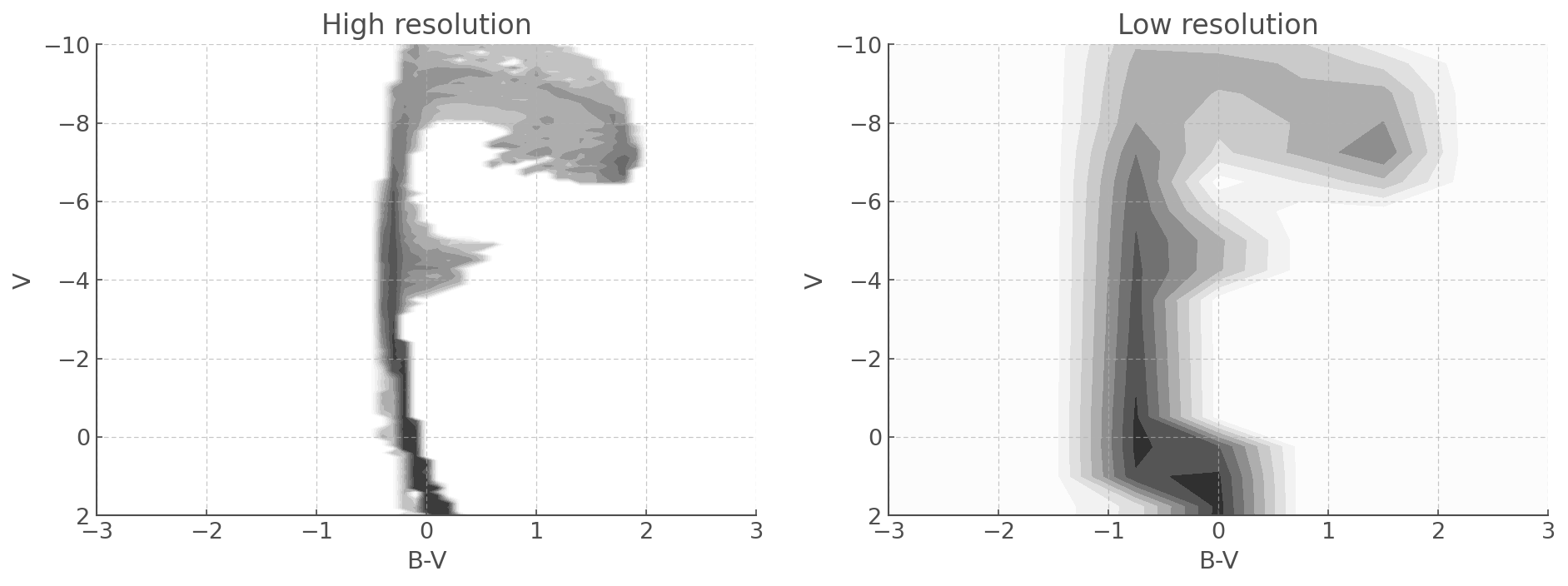
Changing the resolution of the CMD grids
As we can see we have 51 time bins, 240 magnitude intervals and 100 colour intervals.
The number of time bins is fixed by BPASS but you can chose the size of your colour-magnitude grid and its resolution when you instanciate a CMD object.
[16]:
blurry_cmd = CMD(input_file, col_lim=[-3, 7], mag_lim=[-14, 10], res_el=0.75)
blurry_cmd.make(mag_filter='V', col_filters=['B', 'V'])
Plotting the CMDs
Like I said above, once the grid is made and filled, plotting is quick and straight forward. As in other hoki tools the plotting function returns the plot, which you can store in a variable to add your own labels and customize limits.
Similarly to the hoki.HRDiagrams plots, the contours are on a log scale.
[17]:
plt.figure(figsize=(8,6))

myplot = mycmd.plot(log_age=6.8) # Here you can chose the time bin you want to plot.
myplot.set_xlim([-1,2.0])
myplot.set_ylim([2,-10])
[17]:
(2.0, -10.0)

As with the HRDiagrams, you can also tell the plotting function where your want it to plot your data!
[18]:
fig, ax = plt.subplots(1,2, figsize=(15,5))

mycmd.plot(log_age=6.8, loc=ax[0]) # Here you can chose the time bin you want to plot.
ax[0].set_xlim([-3,3.0])
ax[0].set_ylim([2,-10])
ax[0].set_title('High resolution')

blurry_cmd.plot(log_age=6.8, loc=ax[1]) # Here you can chose the time bin you want to plot.
ax[1].set_xlim([-3,3.0])
ax[1].set_ylim([2,-10])
ax[1].set_title('Low resolution')
[18]:
Text(0.5, 1.0, 'Low resolution')
Pickle CMDs - don’t make them twice!
Because it is a little time consuming to create the synthetic CMDs, we actually recommend you pickle your CMD objects. This will allow you to re-use them in the future and plot them virtually instantly, by-passing the CMD.make() step.
Loading a pickled CMD file
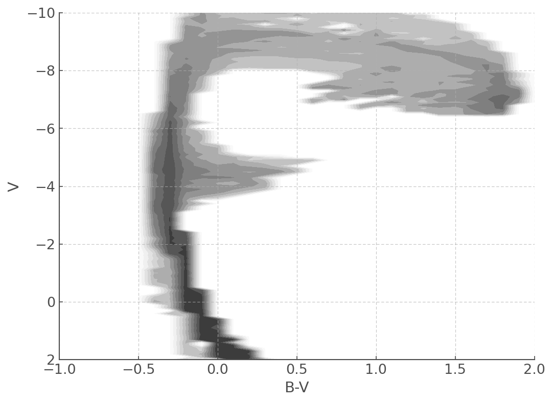
We’ve provided a couple of pickled CMD files in the ./data/cmds/ directory for you to try even if you couldn’t download the full sets of stellar models.
[19]:
pickled_cmd = unpickle(path='./data/cmds/cmd_bv_z020_bin_imf135_300')
[20]:
plt.figure(figsize=(8,6))

myplot = pickled_cmd.plot(log_age=6.8)
myplot.set_xlim([-1,2.0])
myplot.set_ylim([2,-10])
[20]:
(2.0, -10.0)
Pickling a CMD file
Now let’s make your own pickle file! If you have the stellar models and made the CMD in the previous sections of this tutorial, you can now save your work!
All you need is the following code (feel free to change the output file name).
[21]:
# First we open a file we can write into
outfile = open('./data/cmds/BV_CMD.pckl', 'wb')
# Then we call the 'dump' function from the pickle module to dump our cmd in our output file
pickle.dump(mycmd, outfile)
# And to avoid funny business we close our file.
outfile.close()
[22]:
new_pickled_cmd = unpickle(path='./data/cmds/BV_CMD.pckl')

plt.figure(figsize=(8,6))

myplot = new_pickled_cmd.plot(log_age=6.8)
myplot.set_xlim([-1,2.0])
myplot.set_ylim([2,-10])
[22]:
(2.0, -10.0)

Creating a publication-ready figure
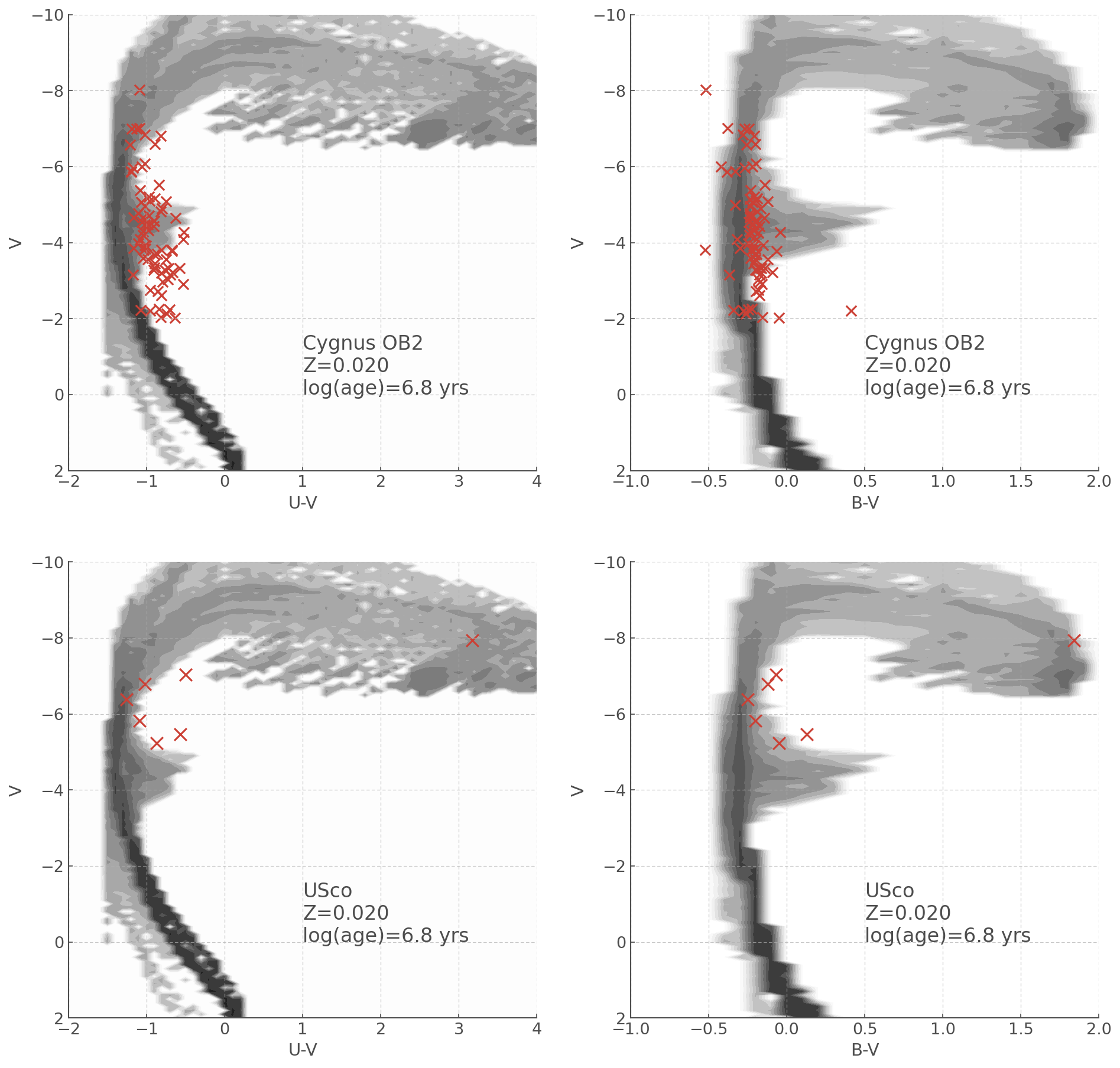
Just like with the HRDiagrams, the tool provided by hoki will allow you to make publication ready figures in not time!
Let’s make a plot comparing the CMDs for Cygnus OB2 and Upper Sco in B-V and U-V plots.
First we need to load our data (which is provided in the ./data/cmds/ repository) - we also need to make sure our observational data is in absolute magnitude, because that’s what our synthetic CMDs provide. If extinction is important in your osbervational data, you also need to take that into account.
[23]:
# Cygnus OB2 data
Av, cyg_U, cyg_B, cyg_V = np.genfromtxt('./data/cmds/cygnusob.dat', unpack=True, usecols=(7, 8, 9,10), skip_header=54)

# Assumes Milky Way extinction
Ab = (1.324*Av)
Au = (1.531*Av)

# Distance to Cyg OB2 and distance modulus
d_cygob2 = 1750 #pc
mu_cygob2 = 5*np.log10(d_cygob2)-5

# Taking away the extinction and turning our mags into absolute mags
# Note it was derived from single star models so extinction may be a tad off
# for your science, feel free to do a better job of it ;)
cyg_U, cyg_B, cyg_V = cyg_U-Au-mu_cygob2 , cyg_B-Ab-mu_cygob2 , cyg_V-Av-mu_cygob2

# Now calculating colours
cyg_UV = cyg_U-cyg_V
cyg_BV = cyg_B-cyg_V
[24]:
# Upper Sco data
p, usco_U, usco_B, usco_V = np.genfromtxt('./data/cmds/usco.dat', unpack=True, usecols=(1,2,3,4), skip_header=1)

# Distance modulus - this time based on parallax.
# (Note I inverted parallax to make this tutorial quick - don't @ me.)
# Extinction is not a problem for this data set
mu = 5*np.log10(1/p)-5
usco_U, usco_B, usco_V = usco_U+mu, usco_B+mu, usco_V+mu

# Calculating colours
usco_UV = usco_U-usco_V
usco_BV = usco_B-usco_V
[25]:
# Unpickling our BV and UV cmds!
BV_cmd = unpickle(path='./data/cmds/cmd_bv_z020_bin_imf135_300')
UV_cmd = unpickle(path='./data/cmds/cmd_uv_z020_bin_imf135_300')
Now let’s plot the data!
[26]:
fig, ax = plt.subplots(2,2, figsize=(15,15))

# This is a bit off on the colour axis which is probs just because of my conversion from Av to Ab and Au
UV_cmd.plot(log_age=6.8, loc=ax[0,0])
ax[0,0].scatter(cyg_UV, cyg_V, s=70, marker='x')

BV_cmd.plot(log_age=6.8, loc=ax[0,1])
ax[0,1].scatter(cyg_BV, cyg_V, s=70, marker='x')

myplot.set_xlim([-1,2.0])

# this is not the same data as the paper
UV_cmd.plot(log_age=6.8, loc=ax[1,0])
ax[1,0].scatter(usco_UV, usco_V, s=100, marker='x')

BV_cmd.plot(log_age=6.8, loc=ax[1,1])
ax[1,1].scatter(usco_BV, usco_V, s=100, marker='x')

for axis in ax.reshape(4):
    axis.set_ylabel('V', fontsize=14)
    axis.set_ylim([2,-10])

for i in [0,1]:
    ax[i,0].set_xlim([-2,4])

    ax[i,1].set_xlim([-1,2])


ax[0,0].text(1,0, 'Cygnus OB2\nZ=0.020\nlog(age)=6.8 yrs', fontsize=16)
ax[0,1].text(0.5,0, 'Cygnus OB2\nZ=0.020\nlog(age)=6.8 yrs', fontsize=16)
ax[1,0].text(1,0, 'USco\nZ=0.020\nlog(age)=6.8 yrs', fontsize=16)
ax[1,1].text(0.5,0, 'USco\nZ=0.020\nlog(age)=6.8 yrs', fontsize=16)
[26]:
Text(0.5, 0, 'USco\nZ=0.020\nlog(age)=6.8 yrs')
YOU’RE ALL SET!
I hope you found this tutorial useful. If you encountered any problems, or would like to make a suggestion, feel free to open an issue on hoki GitHub page here or on the hoki_tutorials GitHub there.